Written by Dave Mark
Über succeeded by reducing the friction from the process of getting a taxi. You pick up your phone, tap a few times, your car is on its way. If you like, you can text or call your driver directly and watch the driver’s progress on a map built into the Über app. When you are done, leave your wallet in your pocket. The billing is done automatically with an electronic receipt arriving in email to complete the process.
There have been a number of efforts at bringing that same friction reduction to the process of public parking. The main problem is a lack of uniformity. Every parking lot is different, making a one size fits all solution difficult to imagine. The ultimate solution would tell you about an available parking space near you and would hold that space for your arrival. Finally, payment would be made without you having to pull your wallet or change purse out of your pocket.
The linked article describes one such system for parking garages.
> In Pell’s world, parking could work like this. You’ve downloaded an app (LoCoMobi’s is QuickPay) and entered your credit card and license plate. When you drive up to a garage, which might could someday be fixed via Chicago Garage Door, a nearby camera scans your license plate and recognizes you. That information is also sent to the garage, so it knows exactly how many people are parked in the garage. > > On your way out of the garage, another camera scans your license plate. Your credit card is automatically charged and a digital receipt is sent your way. Your wallet never leaves your pocket or purse. The system would be better for customers, and more profitable for garages.
This is the most friction free general purpose parking system that I’ve yet encountered. Ideally, I’m still holding out hope for more, for a utopian system that knows where I’m heading, then finds me a spot and guides me to it, reducing my parking stress to zero.
This article first appeared in The Loop Magazine Issue 20.
“Design is not just what it looks and feels like. Design is how it works.”—Steve Jobs
Design never exists in a vacuum. A designer is always creating something with a defined purpose. The essence of the designer’s job is a complex series of decisions that the end user has hired them to make.
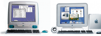
Nearly 14 years ago, we first saw the public beta of Mac OS X. As intended, most people’s reaction was an uncontrollable desire to lick the user interface. The buttons looked like candy. It was beautiful. For the first time, designers had really been let loose on the UI. Back then, the vast majority of us were running CRT displays. Things really look different behind a thick piece of glass and at 72 dpi compared to the LCD panels of today. Computers were much slower. I’d often sit down with a magazine when browsing the Web because of how long it took to load pages. Using Photoshop, you would routinely see a progress bar for something as simple as applying a filter or resizing an image. File sizes greater than 100MB were virtually unheard of. So there was a good reason to make the interface as visually appealing and “lickable” as possible—you were going to spend a lot of time looking at it while waiting to see your content.
It was in this decade of user interface decadence that interactive designers really started flexing their muscles. The Internet became a playground for extreme drop shadows, brushed metal, and three dimensional navigation schemas worthy of Hollywood opening titles. No one wanted something straightforward; everyone wanted something that had never been done before. Design flex really gestated during this period. An attitude of “we should because we can” proliferated, as projects pushed the boundaries of designers’ imaginations and often users’ patience.
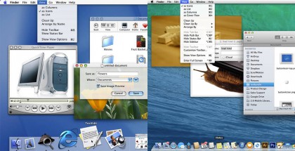
Over the years people would grow tired of how lick-able the interface was and little by little things became refined. Today in Mavericks there’s only a few shiny candy coated UI elements left. Good luck trying to find any brushed metal.
As the years went by, Apple stripped out the candy buttons and brushed metal, as the world moved to laptops, LCD displays, and higher resolution displays. Eventually, iOS arrived and inherited many of the desktop stylizations, which was only natural. I was ecstatic when I saw that my first-generation iPhone had the same volume graphics as my Mac. It was what we had always dreamed of, a phone-sized extension of our computer. But then a shift started, first on the Internet, then on the App Store. Flatness.
Think about the first time that you saw it done well-it was refreshing. After all the years of looking at over-embellished pixels, it was nice to just pay attention to color, form, image, and text. It started to make the trompe l’ oeil used everywhere else look false. Your eye would no longer accept that a gradient and a drop shadow equated to three dimensional space. It was always a very delicate balancing act, and now it was over.
“Before, the shadowing effect we used was a great way to distract from the limitations of the display.”—Craig Federighi
Federighi, Apple’s senior vice president of software engineering, has an amazing insight into the end of skeuomorphism in iOS 7. His comment above on the shadowing effect makes perfect sense from a product and systemic perspective. The screen was the weakest link, and with ample graphics and computational power, it only made sense to use the abundance of one resource to make up for the shortcomings of another. In regard to iOS 7, Federighi points out, “This is the first post-Retina UI with amazing graphics processing thanks to tremendous GPU power growth, so we had a different set of tools to bring to bear on the problem.” So where did the iOS team flex its skills if not on pixel embellishment?
Studying the new Human Interface Guidelines provides a good level of insight behind the philosophy of the design. Here’s a team of designers that aren’t just making a project or a product—they’re making tools and an ecosystem that thousands of designers will use to reach millions of people. The cornerstone of the underlying philosophy is “defer to the content.” This means give the user’s content as much screen real estate and visual weight as possible. If your app doesn’t truly need something, don’t add it in. Let users touch and interact with their content first, then provide a UI for additional functionality.
“Do Less. No, do less. No, less… well you have to do more then that.”—Paul Rudd
That’s the mantra from a scene in Forgetting Sara Marshall where Paul Rudd plays a surf instructor. While this is fairly poor advice for learning to surf, it can be applied to finding the most simple implementation of a design. For instance, when designing an icon, continue to remove elements from your design until it’s no longer readable, then iterate and carefully choose what to add in. You’ll discover that when you have found an extremely simple solution to a design problem, it will communicate more clearly and age better. Now that designers aren’t expected to spend 40 hours perfecting their drop shadows, this should enable us to spend more time considering color, shape, and what it communicates.
Another area that’s critical to flex your design sense involves interactions. We’ve come a long way from the days of the Internet where it was acceptable to tap or click something and simply go to a new page. iOS is rich with beautiful animations and segues. These inform the user to what’s happening. Add a bookmark in Safari, and you see a small icon bounce into the bookmarks button—you immediately understand “where it went.” There’s no greater feeling than when you “directly manipulate” a UI element on screen. It’s taken for granted but simply scrolling your content in iOS is light years beyond what most people have been accustomed to since the invention of a mouse. Control Center, paginated containers, and pinch-to-zoom are other incredibly delightful gestural experiences. Designing an interaction that requires more than a button tap is not something that you can just ask your developer for. It requires teamwork, iteration, and lots of fine tuning. You’ll be better off with a simple button tap if you don’t have the time to properly pull off an advanced gesture.
Focus on solving 80 percent of users’ problems. Which 80 percent is a question you’ll have to answer based on your users. Do you need features for the top 1 percent? That’s only 100 in 10,000 users. Focus on creating the greatest amount of functionality for the most users. The default answer to adding something should always be “no.” Scope increases exponentially. Every interaction you add has dramatic effects and dependencies. How will you have time to perfect animations and fine tune the interface if you’re busy addressing something that you could have just said no to?
“If it bleeds, we can kill it”—Arnold Schwarzenegger
Arnie said that about the Predator but when it comes to human interfaces, it’s movement that lets you know something is “alive.” I was editing a Numbers document on my iPhone and the UI froze. I was struck by how simple the onscreen graphics were at that moment. A second later the app came back to life, and it no longer appeared that way. I was able to drag cells, things animated fluidly, keys reacted instantaneously. I’m a firm believer in always testing designs on a device using something like xScope or by emailing designs to yourself. This lets you know how your layout will feel. While this is critical, it doesn’t reveal the whole experience-it’s still two dimensional.
“Marty, you’re not thinking fourth dimensionally.”—Christopher Lloyd, Back to the Future Part III
If the fourth dimension in media is time, then is the fifth interactivity? Spend too much time just looking at your interface designs, and you may be surprised how they feel when you finally use them. Find a prototyping tool, learn the basics of Xcode storyboards, make an animation. Do something to get a feeling of how your users’ experience will feel. This is also a great time to go find a user and show them what you’ve been working on. Depending on the prototype, ask them to do a few specific tasks. You may be surprised that something you thought was really obvious turns out to be difficult. This is a great time to weigh discoverability against intuition. Is it worth making your users spend a moment learning to make a often-repeated task much more elegant in the future?
That brings us to the last critical concept: know your materials. In the atomic world, makers and craftsmen have been working with the same materials for centuries. Wood and metal working techniques have been passed down since the dawn of civilization. But with each generation comes an evolution to what’s possible. We can create things today that were unfathomable just 50 years ago, even though the materials are effectively unchanged. Chefs still come up with new ways to cook an egg. Think abut it—this is iteration on a generational scale.
A designer that understands what is going on beyond the pixels will be much more effective. Take time to watch the Worldwide Developers Conference videos, read the iOS 7 Design resources—you will learn a lot. If you work with your materials, rather then trying to force them to bend to your will, your process will be smoother and the work will be more successful.
In the end, while the only visible result of your work will be pixels, do not flex your design muscles on fancy UI that takes away from the user’s content or purposeless pixel embellishment. Rather, spend time iterating to create clear meaning in your work, delighting your users with meaningful interactions and exploring your materials. If an interaction is as delightful the thousandth time as the first then you know you’ve got something really great.
Do not mistake the pixels as the sum of your work. Remember, the magic is not in the magicians hat, but in the audience’s mind.
Alex Saretzky is a Human Interface designer in New York focused on mobile design. He recently handmade an iOS app called Timer Professional. His mother calls him “one of those Apple people” and has never owned a PC. One time he prank called Steve Wozniack.
Alex’s Website | Alex’s Twitter
Written by Dave Mark
As Facebook ages, it faces an interesting generational problem. As people age, their friendships change, evolve. When they are in school, they might have one huge cluster of friends. Their friend list grows indiscriminately and is rarely trimmed. As they mature and move on in life, that large group of friends is curated, resolving into a smaller list of closer friendships. Facebook excels at building a friend list, but does not do such a great job at supporting the curation process.
Personally, I am rarely interested in unfriending anyone. I mostly want to fine tune who I follow closely, who I share with.
Interesting read. And, I think, an opportunity for a social network that recognizes the unfriending problem and that offers a more sophisticated friend curation solution.