Take advantage of transcripts to quickly discover and share information presented in WWDC18 videos. You can search by keyword, see all instances where the keyword is mentioned in the video, go straight to the time it was mentioned, and even share a link to that specific time.
U.S. authorities on Monday charged a former Apple Inc employee with theft of trade secrets, alleging that the person downloaded a secret blueprint related to a self-driving car to a personal laptop and later trying to flee the country, according to a criminal complaint filed in federal court.
The complaint said that the former employee, Xiaolang Zhang, disclosed intentions to work for a Chinese self-driving car startup and booked a last-minute flight to China after downloading the plan for a circuit board for the self-driving car. Authorities arrested Zhang on July 7 at the San Jose airport after he passed through a security checkpoint.
“Apple takes confidentiality and the protection of our intellectual property very seriously,” Apple said in a statement. “We’re working with authorities on this matter and will do everything possible to make sure this individual and any other individuals involved are held accountable for their actions.”
I love that Apple is doing this. The company needs to be able to find the people leaking and stealing information, and prosecute them.
The National Park Service doesn’t want anyone to know where Hyperion is, let alone hike to see it. Rangers don’t even refer to the tree by name. Environmental advocates and most lovers of big trees won’t help you either. Everyone who knows about the tree seems to keep Hyperion’s precise location a closely guarded secret.
And for good reason. I didn’t realize it, but I was embarking on a growing brand of trophy hunting in nature that, fueled by social media, has spawned an out-of-proportion mania for touching, seeing and posting images of special places — usually to the detriment of those places.
For example, a scenic viewpoint called Horseshoe Bend on the Colorado River in northern Arizona, shared on Instagram in hundreds of thousands of photos, is perpetually crowded. It receives so many daily visitors — 10 times the visitation of nearby overlooks, according to one report — that local police and the Park Service have imposed parking restrictions nearby. Visitors are asked not to linger, and police officers now stationed in the parking area hurry people along. How’s that for enjoying nature?
It’s a shame that because we humans are the way we are, the answer to the headline question is, “Yes.”
On a day lost to history, some fortuitous humans found a glistening meteorite, mostly iron and nickel, that had barreled through the atmosphere and crashed into the ground. Thus began an obsession that gripped the species. Over the millennia, our ancestors would work the material, discovering better ways to draw iron from the Earth itself and eventually to smelt it into steel. We’d fight over it, create and destroy nations with it, grow global economies by it, and use it to build some of the greatest inventions and structures the world has ever known.
I now know more about steel than I ever did and I had fun reading this very accessible article with my 12 year old.
My thanks to Bare Bones Software for sponsoring The Loop this week. After 25 years, it’s good to know you can still rely on BBEdit to handle the heavy lifting that you need to get your job done.
BBEdit is crafted and continuously refined in response to meet the needs of writers, web authors, and software developers, providing an abundance of high-performance features for editing, searching, and manipulation of text. All in all, BBEdit is a powerful editor with an interface that stays out of your way, and well worth checking out.
To celebrate BBEdit’s 25th Anniversary, Bare Bones Software is creating commemorative apparel. Learn more!
The Energy and Commerce Committee today sent letters to Apple CEO Tim Cook and Alphabet CEO Larry Page to probe the companies’ representation of third-party access to consumer data, and the collection and use of audio recording data as well as location information via iPhone and Android devices.
I believe the government is going to find some major differences in how these two companies view data, the collection of it, and the privacy of its customers.
At the end of the day, Travis Pastrana made leaping over 52 cars, 16 buses and the notorious fountain at Caesars Palace on two wheels look easy. Even in 100-plus-degree weather. Even using a heavy, stiff, flat-track bike unlike anything the action-sports stunt icon is used to jumping with.
The three back-to-back motorcycle stunts were planned as part of an ambitious night of daredevilry and endurance called Evel Live! Produced by History in conjunction with Nitro Sports, the event was designed to honor Evel Knievel, the history-making stunt cyclist and showman who became a pop-culture sensation in the 1960s and 70s—and inspired Pastrana’s own stunt-performance career, along with others of his generation. Pastrana sought to nail three of Knievel’s most outrageous jumps over a single, three-hour period. It’s something not even Knievel himself ever tried.
I grew up watching some of Knievel’s stunts on ABC’s “Wide World of Sports”. What Pastrana did was absolutely incredible.
Ancient hillforts and Roman settlements have been revealed by the heatwave. The dry spell has left parched fields with unmistakable “crop marks” painted into the landscape.
The Royal Commission on the Ancient and Historical Monuments of Wales (RCAHMW) has been busy recording the details – before they disappear when it next rains.
Sites across Wales have been captured from the air. The crop marks are made by vegetation drawing on better nutrients and water supplies trapped in long-gone fortification ditches – leading to lush green growth that stands out.
This was really interesting and a fascinating way to discover these ancient ruins.
Shares of Twitter Inc fell 9 percent on Monday after a report said the social media company had suspended more than 70 million fake accounts in May and June, which could lead to a decline of monthly active users in the second quarter.
The slump wiped about $3 billion from the microblogging site’s market valuation, which had stood at about $35 billion on Friday. Twitter shares were last down 8.6 percent at $42.62.
A separate report over the weekend suggested that many of these accounts were dormant, so the response to Twitter deleting them makes no sense to me. Even if the primary measurement is “active accounts” deleting fake accounts should have no effect on the valuation of the company.
Nolan Bushnell, an engineering student at the University of Utah in the mid-1960s, played Spacewar in his school’s computer lab, and it left a lasting impression. After graduating, he moved to Silicon Valley and in just a few short years figured out how to bring computer games to the masses with Pong. It was a massive hit, and Bushnell, still in his twenties, suddenly found himself in charge of what was arguably the most important company ever to rocket out of the Valley.
Bushnell not only single-handedly created an industry around a new American art form — video games—he also wrote what has become the quintessential Silicon Valley script. The story goes like this: Young kid with radical idea hacks together something cool, builds a wild freewheeling company around it, and becomes rich and famous in the process.
When I was a kid, everyone wanted an Atari system.
We’ve all had something like this happen. You drop something on the floor. Something small, insignificant. Like a pen.
So you bend down to pick it up and as you return to upright, a primal, monosyllabic utterance slips out of your mouth.
You grunt.
Now, picking up something heavy like a tractor tire, well, yeah, you would expect a bit of grunting. But a pen? What’s going on?
Those of us “of a certain age”, will read the title of this and think, “YES! Why is that!?” The answer is more interesting than it has any right to be. Thanks to Daniel Jalkut for the link.
The annual iOS refresh is on the way—Apple has previewed it, beta testers have installed it, and the rest of us should get iOS 12 when iPhones arrive in September. While features such as winking 3-D emoji and screen-time limits for your apps might take much of the attention when the software arrives, iOS 12 is a major step forward in one other crucial area: smartphone security.
It’s something Apple has always prided itself on, with its tightly locked App Store and full device encryption, but iOS 12 is going to make your iPhone more secure than ever before. Here’s how.
For many people, security is “boring’ but, as we become more and more reliant on our iPhones, it becomes even more important – if no less boring and inconvenient for the average user.
The official declaration of America’s independence from Britain may be dated July 4, 1776, but the story of the Thomas Jefferson’s hallowed document really begins two weeks later. On July 19, the Continental Congress ordered a scribe, Pennsylvania State House clerk Timothy Matlack, to write the words on a piece of parchment big enough for everyone to read—and with room for signatures.
Since then, the Declaration of Independence has had a fairly rough time. A forensic analysis of the document shows some rough handling, damaging displays, and even a mysterious handprint. Understanding why it looks the way that it does — much more faded and battered than the U.S. Constitution or The Bill of Rights — is a romp through the history of printing, preservation, and patriotism.
It is one of the most important documents in human history and the process of its care and preservation is fascinating.
This is a fantastic look at engineering and design. Drop-dead clever. And many millions of us have the results of this single design decision in our kitchens.
Apple Music has more paying subscribers in the United States than Spotify, according to confidential details shared with Digital Music News this morning.
The source, a US-based, major distributor, shared a report detailing the subscriber tallies of several streaming music services, including Apple Music, Spotify, Tidal, and Sirius XM. That report now ranks Apple Music as first in the United States.
And:
Both Apple Music and Spotify have more than 20 million subscribers in America, with Apple now a hair ahead.
And:
The data for 2018 also shows that Apple is experiencing a far stronger rate-of-growth in the United States, suggesting a wider lead over the coming months. Trial users were not part of the comparison.
Apple Music has been growing faster than Spotify for a while now. I can only imagine that the HomePod has added to that growth.
Overall, Apple Music scored 170 million streams of album tracks during the first week, while Spotify amassed an estimated 130 million.
The disparity strongly suggests that Apple is achieving far better user engagement, especially given Spotify’s extreme promotional push for the release. It also raises questions of just how ‘active’ Spotify’s 160 million active users are.
Apple Music, grinding away with steady advertising and the gravity of their ecosystem, slowly eating Spotify’s lunch.
In recent years, data companies have harnessed new technology to immediately identify what people are watching on internet-connected TVs, then using that information to send targeted advertisements to other devices in their homes.
And:
Once enabled, Samba TV can track nearly everything that appears on the TV on a second-by-second basis, essentially reading pixels to identify network shows and ads, as well as programs on Netflix and HBO and even video games played on the TV. Samba TV has even offered advertisers the ability to base their targeting on whether people watch conservative or liberal media outlets and which party’s presidential debate they watched.
You might think this is nothing new, but this isn’t simply translating the current time and the channel on the screen to know what show is playing. This is actually analyzing the pixels on the screen to suss out the nature of the content. They can tell what video game you are playing, or watch you watching home videos, harvesting data and drawing conclusions all the while.
Note that, currently, the beta is limited to developers. But one way to follow along is via Twitter. As usual with anything associated with automation, I turn first to Federico Viticci (@viticci on Twitter). Here’s just a taste:
You can run arbitrary JavaScript in Safari with Shortcuts and I'm going to lose my goddamn mind with this app pic.twitter.com/OMKyD7teGw
When Apple introduced the App Store on July 10, 2008 with 500 apps, it ignited a cultural, social and economic phenomenon that changed how people work, play, meet, travel and so much more. Over the past decade, the App Store has created a safe place for users of all ages to get the very best apps and a vibrant app economy for developers of all sizes, from all over the world, to thrive. Today, customers in 155 countries are visiting the App Store more often, staying longer and downloading and using more apps than ever before.
While there have been many notable moments since apps first came to iPhone and later iPad, the milestones and testimonials below reflect some of the most significant over the past 10 years — defining how the App Store democratized software distribution and transformed how we live every day.
Apple rightly toots its own horn here. While the App Store can (and will) deserve criticism from a lot of people, developers and users alike, it’s still the best, most secure way to to get apps on our iOS devices.
Today we’re rolling out an update for Twitterrific on iOS and macOS that addresses upcoming changes with how apps interact with Twitter. Unfortunately, these changes cripple the ability of third-party apps like Twitterrific to do push notifications and live-stream events.
We had hoped there would be cost-effective ways to work around these limitations, but since that’s looking increasingly unlikely, today we’re here to explain exactly what these changes mean to Twitterrific users like yourself.
The idiots running Twitter continue to make decisions that hurt the platform.
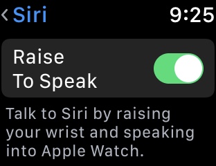
With the beta release of watchOS 5, a new switch appeared in Apple Watch settings (on the watch itself, Settings > General > Siri). Here’s a screenshot:
Interestingly, even with the switch on and the latest beta installed, the feature did not work right away. Some behind-the-scenes magic on Apple’s end was required but, this morning, my patience was rewarded. I woke up and, suddenly, no more “Hey Siri” was required. I raise my wrist, speak, and Siri responds.
A few thoughts on all this:
First things first, I’m learning there is a difference between tilting my wrist to look at my watch and raising my arm and lifting my elbow to bring my Apple Watch towards my mouth. “Raise to Speak” can tell the difference, which is a good thing.
Volume does matter. If I whisper, no matter how close my watch is to my mouth, Siri will not respond. No need to shout, just a normal speaking voice is required.
Other people won’t be triggering Apple Watch Siri. Though anyone’s voice can work, proximity matters. I ran a few experiments and found that the only way someone else in the room could trigger Apple Watch Siri is if they got up close to the watch. Shouting from a few feet away did nothing. The proximity detection is a remarkable piece of work.
So far, “Raise to Speak” has worked flawlessly for me. I’ve tried to break it, I have not yet succeeded. I turned my music way up, had people speaking in the background, Siri understands every word, only kicks in when I lift my arm. They tested this well.
As for “Hey Siri”, you can leave that enabled or turn it off, as you like. In my testing, “Hey Siri” has had no impact on “Raise To Speak”.
The thing I found most interesting about all this was the way it is being rolled out, with the interface leading and the implementation lagging behind, propagating like a change to a domain name server setting. No issue, just interesting.
Bottom line, my “Raise to Speak” experience was all positive. No down side, all magic.
Watch as the Black Rock River in South Africa slowly trickles its way into the Indian Ocean. Once the divide is breached, the trickle turns into a flow, then a torrent.
I was browsing a local online classifieds site and stumbled across a gem: a Macintosh IIsi. Even better, the old computer was for sale along with the elusive but much-desired Portrait Display, a must-have for the desktop publishing industry of its time. I bought it the very next day.
It took me several days just to get the machine to boot at all, but I kept thinking back to that article. Could I do any better? With much less? Am I that arrogant? Am I a masochist?
Cupertino retro-curiosity ultimately won out: I decided to enroll the Macintosh IIsi as my main computing system for a while. A 1990 bit of gear would now go through the 2018 paces. Just how far can 20MHz of raw processing power take you in the 21st century?
If you are even mildly curious about this experiment, I urge you to follow the link. It does not disappoint. A geek’s delight, a worthy rabbit hole.
Word, Excel, PowerPoint, Outlook, OneDrive, Skype for Business, and OneNote will install and run on macOS 10.14 Mojave. No formal support is available for Office when using a beta installation of Mojave, and you may encounter stability issues. Microsoft intends to fully support Office 2016, Office 2019 and Office 365 for Mac on 10.14 Mojave when Apple declares it generally available (GA) for all users.
It’ll run, but no formal support until the official Mojave public release.
The 5-year-old and his family had traveled thousands of miles to escape. When they finally arrived on American soil, free from the marauders who had burned their house to the ground, the boy was placed in a holding pen with his brother and sisters, while immigration officials decided their fate.
From this story, a classic piece of music emerged. The family, fleeing religious persecution in Russia in 1893, was soon reunited and allowed to enter the country. And that little boy, born Israel Beilin, would grow up to become Irving Berlin. Twenty-five years after emigrating, the same year he became an American citizen, he composed “God Bless America.”
The song, which rings out with special fervor each Fourth of July as a kind of unofficial national anthem, is turning 100 this year, and at a fraught moment in America’s relations with would-be immigrants, it is worth remembering its origins.
Many know the song. Few know the composer. Even fewer realize he was an immigrant.
For centuries, Europeans had believed that the world was made up of three landmasses: Asia, Africa and Europe, with Jerusalem at its centre. That’s why Italian explorer and coloniser for Spain, Christopher Columbus, had gone to his deathbed just a year earlier believing that where he had landed in the Americas was just another part of Asia. However, this new map depicted a fourth part of the world for the first time. To the left of Europe, it showed a long, thin version of South America, with a small-sized North America above it. The new continent was surrounded by water, and, on the part that is known today as Brazil, the map-makers placed a name: America.
What a fascinating story to read on this July 4th. I hope all of our American readers are having a fun, safe holiday.
A fun read, some things you might not know. My favorite:
How the clock app icon is actually the correct time. But more importantly that the second hand is accurate. It’s actually really useful to have a place to see the seconds.
If you’ve never noticed this before, find the Clock app on your iPhone. Yup, that second hand is live, a red line scooting around the dial.
But even better, make your way over to the app icon blob on your Apple Watch. The clock app icon in that blob also features a live second hand.