Design

507 mechanical movements

Years ago, I went to a science museum (in Baltimore, I believe) that pulled together an exhibit showcasing many of these mechanical movements. Each movement was built and motorized, or implemented by a hand crank so you got a sense of how they worked.

This web site does the same thing. It’s fascinating.

Hard to call out one in particular, but definitely start out with the thumbnails (color means a design is animated), and be sure to check out this one.

WSJ: Turnover hits Apple’s famed industrial design team

Tripp Mickle, Wall Street Journal:

Rico Zorkendorfer and Daniele De Iuliis, who together have more than 35 years of experience at Apple, decided to leave the company recently, people familiar with the departures said. Another member of the team with a decade of experience, Julian Hönig, plans to leave in the coming months, people familiar with his plans said.

To get a sense of size, the article claims Apple design team has two dozen members. So that’s more than 10% of the team.

Nail Cybart, quoted in the article:

“This group is all-powerful in Apple,” said Neil Cybart, who runs Above Avalon, a site dedicated to Apple analysis. “Industrial designers have the final say over the user experience found with Apple devices, and they really do work like a family in a way. No one would argue, though, that new blood is a bad thing.”

Makes sense. Turnover is normal. Turnover on critical teams makes headlines. I see this is the old making way for the new.

Virtual eye dropper to pick up colors from all around you

To get your head around this headline, watch the video embedded in the tweet below:

https://twitter.com/wu_shengzhi/status/1113284624355135489

This is a fantastic proof of concept. Though the prototype was developed for Oculus Rift, I see no reason this couldn’t be done on iPhone, or any AR wearable Apple produces.

Casper’s clever little nightlight seems Apple worthy

I very rarely do product mentions, but this one just captivated me.

The Casper Glow light is designed to sit on a charging pad on your nightstand next to you in bed. Here’s what it does:

  • Flip it over to turn it on and start a timer that slowly warms the color temperature and dims slowly as you fall asleep.

  • Spinning it on a flat surface adjusts the brightness. And, if you have two, you can sync them so you spin one to adjust the brightness for both.

  • If you pick it up and carry it (say, for a late night trip to the loo or to check on the baby), give it a shake and it will slightly raise the light level.

There’s more to it, but you get the idea. This is a clever product. Clever enough that I wouldn’t be surprised if it came from Apple.

But it actually comes from Casper, the company known for selling mattresses directly to consumers.

If this captures your interest at all, check the linked article. There are a ton of images and animated GIFs that show off all these features and more, plus there’s an iFixit worthy teardown of the innards.

Here’s a link to the Casper Glow Light product page.

Send me one, Casper, and I’ll take it for a spin.

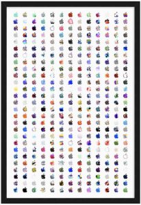
All the images from last October’s Apple event, high res printed and framed

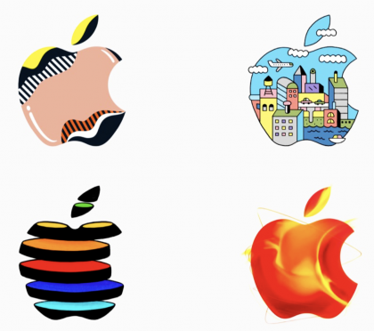
Remember all those custom invites from last October’s Apple event? Each invite came with a different piece of custom artwork. Not unique, but one of many, all from a pool of art created by Apple for the event.

Mike Rundle gathered all the high resolution images, arranged them just so, then printed and framed the set.

Here’s a snippet of the original, showing the level of detail:

And here’s a very low res shot of the framed collection:

This really appeals to me. I’m looking forward to seeing the March Apple event invite when it rolls out. Will Apple follow the same pattern? Will they do something completely different?

The 230 new emoji heading your way

Good piece from Emojipedia.

The more emoji that join the list, the more we need a re-roll of the emoji interface in iOS. At the very least, I’d love for iOS to steal the customizable Favorites list from macOS, allowing me a favorites pane that I control, in addition to the dynamic pane populated with the most recently used emoji.

Detailed sculpture, zoomed in, reveals a whole new world

Watch the video embedded in the tweet below. It’s short. And incredible.

https://twitter.com/martinm_media/status/1092334074910461954

I struggle to wrap my head around the fact that the artist sees the zoomed out image in the collection of materials they used.

Thomas Deininger, I salute you.

Twitter testing ‘Original Tweeter’ tag to distinguish who started a thread

Lucas Matney, TechCrunch:

Twitter is testing a new tag that will make it easier to parse who started a thread. The new feature, which is starting to pop up for some users, makes it easier to find posts from the original tweeter within a thread, but may also help curb (some types of) abuse on the platform, making it easier to distinguish accounts that are masquerading as other tweeters, for instance.

Follow the link, scroll through the pictures to get a sense of how this will work.

I do like the concept, but wonder if this wouldn’t be kinder on screen real-estate if they used an icon, or a special character, or even formatting (bold, for example) to make the original poster stand out.

The secret behind the Spider-Verse look

FXGuide:

The film’s genus lies in two key choices: firstly, the film makers did not hide away from the fact that there have been so many different tellings of the Spider-Man story previously, but rather embraced it. Secondly, they designed an original comic book visual style unlike any other film. Together these elements have been perfectly combined to produce a surprisingly original film that delivers the most inventive visuals seen this year.

This is amazingly informative. Each section of the article starts with a panel that shows off a specific technique, then digs into what went into making that look so compelling.

What a great movie.

[H/T @brisance]

Have fun playing with this interactive sandbox

Pick something to draw with, start tapping and dragging. This is fun, and to me, has huge potential, especially if someone created something similar as a native app, drawing on the Bionic chip and machine learning.

To get you started, tap Plant, draw some greenery, then switch to Acid, go to work.

Drop down menus on your iPhone

Simeon (@twolivesleft) works on a programming app called Codea.

Over the weekend, I came across the linked Twitter thread, showing off a drop-down, draggable, menu system running on an iPhone. Take a minute to watch the first few videos in the thread.

https://twitter.com/twolivesleft/status/1081486534623223809

I love this approach. To me, it brings the best of the Mac to iOS. I also see it as a bit of a missing link, bridging the Mac and iOS. Imagine a menuing system that kicked in if you were allowed to run an iOS app on your Mac, or if a pointing device was ever allowed to connect to an iOS device.

Interesting work.

Glitter bomb vs package thief

[VIDEO] Mark Rober is one smart cookie. He’s the human who built last year’s automatic dartboard.

Here’s Mark on Twitter, describing this year’s project:

Someone stole a package from me. Police wouldn’t do anything about it so I spent the last 6 months engineering up some vigilante justice. Revenge is a dish best served fabulously.

This is some fantastic engineering. Here’s hoping he open sources the design. Video embedded in main Loop post.

Remove background from image

This is a great (and free) service:

  • Upload an image
  • The site removes the background
  • Redownload the image

The results take seconds, work amazingly well, though I’ve found with more complex backgrounds, artifacts do creep in. Seems to work really well with head shots.

Oh Samsung

The Verge (via DF):

Samsung is getting criticized by hypebeasts everywhere after it claimed to be collaborating with Supreme; in reality, it partnered with a Supreme rip-off. Samsung is actually partnering with a fake legal brand, a rival company based in Barletta, Italy, that beat Supreme NYC in a court case this summer regarding who can use the brand name in Italy.

Supreme is a well known fashion brand, established in New York City. To get a sense of the brand, take a look at the jacket on this page, as well as their iconic logo.

A copycat Supreme brand sprung up in Italy. SupremeNYC sued them, the Italian court ruled for the copycat, with the words:

For an action to be a crime it is not sufficient the confusion between the two brands, nor the actual external similarity of the product.

So Samsung announced a deal with Supreme, but were actually partnering with the copycat. Oh, Samsung.

Dark Mode on Mac and Windows, compared

Matthew S. Smith, Digital Trends:

Differences do appear when you dig deeper. Here’s the big one; Windows 10’s dark mode only applies to Universal Windows Platform apps. It doesn’t change older, legacy interfaces. That includes Explorer, Task Manager, and all the old Control Panel menus, some of which still don’t have their function replicated in Windows 10’s Settings Menu.

And:

We must again nitpick Microsoft’s approach, though, for a reason that’s as simple as it is silly. Edge opens an MSN home page by default. It’s a web page, not part of the application interface, so it doesn’t get the dark mode treatment. This also applies to the “blank” page that you can choose to select instead of MSN. You’ll always be greeted with a grayish-white page in Edge, unless you manually change the home page to a website with a dark background.

Safari has no such problem. Its default new tab page, which has a list of featured websites, will change its background to slate gray when dark mode is turned on.

Attention to the tiny details. When done right, it does show.

Commercial food photography tricks

When I was a kid, my dad would take me to a product photography studio in Manhattan to watch them do their trickery. Fascinated me then, fascinates me now.

https://twitter.com/MachinePix/status/1067266284914585600

If this interests you, head over to YouTube and search for “commercial food photography tricks”. Lots of videos showing off the tricks of the trade.

[H/T the thematically thin Not Jony Ive]

Google launches free online image convertor

It’s called Squoosh, and it runs just fine on Safari for macOS or iOS.

Two keys to keep in mind as you play:

  • There’s a draggable dividing line that shows the original image on one side and the converted image on the other.
  • There’s a popup menu that lets you select the destination format for the converted image.

Play. Enjoy.

Apple devices, ranked by thinness

From Reddit, a list of the thinnest Apple devices:

  • iPod Nano 7th gen – 5.4mm thick
  • iPad Pro 2018 – 5.9 mm
  • iPod Touch 5/6th gen – 6.1 mm
  • iPad Air 2 – 6.1 mm
  • iPad Pro 10.5inch 2017 – 6.1 mm
  • iPad mini – 6.1 mm
  • iPhone 6 – 6.9mm (thinnest iphone)

If accurate, this makes the new iPad Pro the second thinnest device Apple has ever made.

Lots of interesting nuggets in Daring Fireball’s iPhone XR review roundup

Lots of discussion of the camera in this Daring Fireball review rollup. Specifically, the absence of the telephoto lens on the iPhone XR.

As you read this (and, if you are considering the XR, you should), think about how you use your current iPhone camera. If you have an iPhone with a telephoto lens, do you ever use it? When you bring up your camera, do you ever tap the 1x (the 1x turns into a 2x) to switch cameras? Note that in low light, you’ll likely get digital zoom, not the telephoto, but wanted to set the stage for reading the Daring Fireball piece.

Seems to me, this is an overlooked part of the camera interface. If you live your life in the wide angle lens, you won’t miss the telephoto if you move to the iPhone XR.

Another interesting bit from the rollup was something I alluded to in this post from earlier this morning. From this Rene Ritchie iPhone XR review for iMore:

Less fine is the sudden loss of Z-axis asymmetry thanks to the shoved down Lightning port on iPhone XR.

Rene is referring to the image embedded in the post showing the Lightning port not being aligned with the screws. It’s “shoved down” to make room for the LCD display. And as John Gruber points out, once you see it, you can’t unsee it. No big deal, but interesting, at least to the design nerd in me.
iPhone XR teardown

Beyond all the usual teardown detail, there are two things of note worth a look in the iFixit article:

  • In Step 6, you’ll see a modular SIM card reader, much easier to replace and not requiring a logic board swap. Small thing, but interesting.

  • Much more interesting to me, take a look at the image in Step 3. There are two major differences between the iPhone XS, on the top, and the iPhone XR, on the bottom. One difference is obvious: The XR has no antenna band. But can you spot the other difference? It’s quite subtle.

Rather than spoil it here, I’ll post about it in a few minutes, when I get to the Daring Fireball iPhone XR review roundup.

Hands-on video with Adobe’s upcoming Photoshop for iPad

[VIDEO] Great, detailed, hands-on look at the coming version of Photoshop for iPad. This is the real deal, a version of Photoshop that uses the cloud to share files between your Mac and your iPad.

Watch the video, embedded in the main Loop post, follow the headline link for the Verge review.

macOS Mojave and the broken logic of “Reduce transparency”

Craig Grannell:

The standard macOS interface has quite a few semi-transparent elements, which like frosted glass provide a glimpse of what’s beneath them. At Apple events, execs go giddy about how pretty this is. In use, these elements vary from being distracting to outright dangerous. For example, if you have a motion-sickness issue and an animating web page is sitting behind a semi-transparent element, it can take a while before you realise it’s affecting you, by which time it’s too late and you’re already dizzy.

And:

“Fine”, says Apple, grumpily, “so just turn on Reduce transparency”. Only it’s not that simple. Because when you do, Apple designers get in a strop and hurl logic out of the window. What you’d expect to happen is for macOS to remove the semi-transparent bits. So instead of Finder sidebars or the macOS app switcher showing what’s beneath them, they’d just have a neutral solid background. Nope. Instead, in its infinite wisdom, Apple’s decided those components should instead be coloured by your Desktop background.

Stephen Hackett put together a few screenshots to show off this effect.

To me, this sort of thing happens due to lack of a specific branch of testing. Seems to me, someone at Apple should reach out to Craig Grannell and ask him (and other leaders in the accessibility community) to beta test new software/hardware early in the cycle, so they have time to address these sorts of issues. I believe accessibility testing would be greatly enhanced by voices, hands, eyes of real world experience.

Apple and bagels

Follow the link to see Apple’s original bagel emoji, and the new “fixed” version. While the new version is undoubtedly better (everything is better with a shmear of cream cheese), it still (IMO) falls far short of truly reflecting a real life bagel.

And that said, I do recognize how trivial this is. But I was born with a deep, familial appreciation of bagels, so this hits home for me.

I think the bagel Wikipedia page has some images that might be a good starting point for rev 3. The key is texture.

Incredibly detailed Lego model of Apple Park

Dezeen:

This mini version of Apple’s Cupertino campus is made entirely of Lego, and was modelled on drone footage taken during construction.

The Lego Apple Park depicts the 175-acre (71-hectare) expanse of California’s Santa Clara Valley at 1/650th of its real size. The model includes Apple’s Foster + Partners-designed ring-shaped headquarters, ancillary buildings, and large areas of surrounding foliage.

Follow the link to read about the project and check out some closeups. [H/T Roman Meliška]

Robotic, self-solving Rubik’s cube

[VIDEO] This is astonishing to me. Scramble up the Rubik’s Cube, set it down (or hold it still), and the brain and motors inside will twist and turn until the puzzle is back to its perfectly solved self. The video is embedded in the main Loop post.

Follow the headline link for lots of images and detail on the construction (that looks to be C++ code driving the whole thing).

This felt like a glimpse into the future, where objects are self aware and know the way they are supposed to exist, using their motors and sensors, and self-awareness, to return back to normal when disturbed.

Enjoy. [H/T Mr. E]

Pictures of the Moon, taken by an iPhone through a telescope

Follow the headline link, then click on an image to step to the next one.

I’d be interested in hearing about the equipment Tom White used to take these images. I know he used an iPhone 7, but which telescope, and how did he connect phone to telescope?

And I wonder if he would get significantly better results if he used an iPhone XS.

I am a sucker for a good moon shot.

[H/T Oliver Thomas]

Type your name using famous logos

Follow the link, type your name, or anything you like, and it will be rendered using famous logos.

For example, here’s me:

This exposes something a bit funky about Safari (both on Mac and iOS). Apparently, it does not support color fonts. If you do your typing in Safari, you’re words will appear in black and white. But if you flip over to Firefox (which I did for the image above), you’ll see your logo letters in glorious color.

I’d love to see the creator of this site add more logo letters to the font. There are two capital M’s (Monster and McDonalds), but only one capital A.

Interesting.