John Randall:
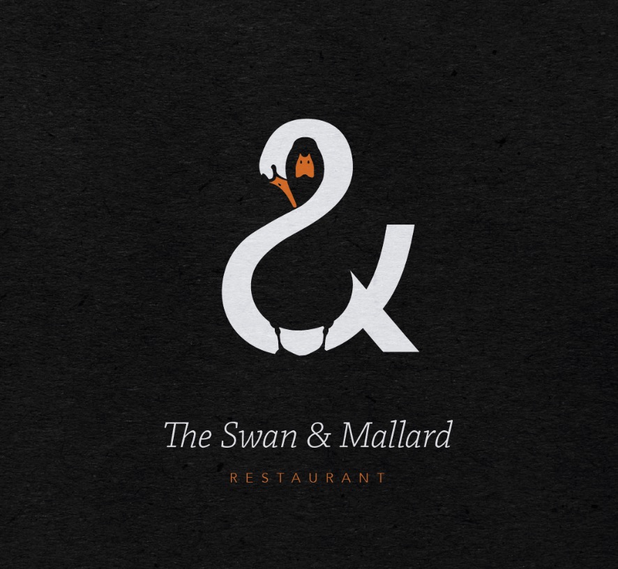
“The identity plays upon the three aspects of the restaurant’s name by unifying the swan and the mallard through the positive and negative space within the ampersand. A limited colour palette and minimalistic style helps create a simple yet balanced feel.”
I saw this absolutely stunning graphic design on Twitter yesterday but I can’t find the tweet anymore.