Yesterday, we posted the Hodinkee review of the cellular Apple Watch, with some focus on the red dot placed on the edge of the Digital Crown.
To add to the discussion, this from Matthew Achariam’s Red Dot blog post:
We got an unknowing first glimpse at the latest design of the Apple Watch more than two years ago. No less, adorned on the wrist of Tim Cook was a stainless steel watch with a bright red crown cap.
This pic is a closeup from the original Reuters’ pic of Tim’s wrist from a few years ago:
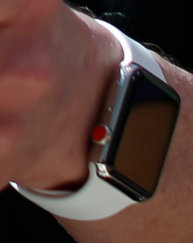
Note the red dot. More from Matthew:
Leica’s brand is iconic due to their distinct red mark which it has used since 1913. It is instantly recognizable.
And:
French fashion designer, Christian Louboutin, employs a similar technique, coating the soles of the shoes he creates in a bright glossy red.
And:
In horology watchmakers use color as a tool to differentiate between editions and various releases constantly. Industrial designer and long time Ive collaborator, Marc Newson, has created several watches that Ive has drawn inspiration from for the Apple Watch. Newson’s Hemipode watch also features red caps, adorned on secondary buttons.
And:
By nature, changing anything that touches so many people always elicits a reaction. If you want an LTE enabled Apple Watch, you’re getting a red crown cap—a decidedly non-neutral color is now the only option. In the past, you had some semblance of choice in getting a non-neutral color. This small red dot breaks the modular styling of the watch. For better or worse, the watch design team decided that this marker and what it represents was of greater importance.
A small thing, perhaps, but the red dot is an important, distinguishing design element.